

Imagine stepping into a beautifully organized room where every item is intuitively placed, guiding you effortlessly to what you seek. This is the essence of visual design in UI/UX — a transformative force that shapes how we interact with the digital world.
Just as a skilled conductor directs an orchestra, visual design orchestrates elements on a screen, ensuring harmony and clarity amid the noise. It doesn’t merely aid navigation; it simplifies your digital journey, saving you time and reducing frustration. As one example of how good visual design can dramatically impact UX, Google estimated their autocomplete suggestions saved users 200 years of typing time per day. Visual design directly informs how efficiently users find and process visual information. When done right, it can mean the difference between a user walking away with the product, information, or answer they need or giving up in frustration.
In this symbiotic dance of aesthetics and functionality, visual design has the power to turn everyday users into satisfied explorers, reshaping their experience with every click and scroll.
What Is Visual Design in UI UX?
According to the Interaction Design Foundation, visual design “aims to improve a design’s/product’s aesthetic appeal and usability with suitable images, typography, space, layout and color.” But visual design is more than just ‘looking good.’ A visual designer carefully places design elements within a user interface in a way that will enhance user experience and drive conversions.
Visual hierarchy is an important part of visual design. It helps people navigate spaces and places by using elements of user experience design to focus on what’s important. This is true in both physical and digital spaces, but organization of web design elements is particularly needed on digital channels where space is limited and distractions are inevitable.
In graphic design, visual hierarchy is how designers organize information and UI design elements on a web page in a specific order of importance. It’s a virtual roadmap for the viewer’s eye – determining what they notice first, second, and third when landing on a page or opening an app (or other digital property.)
Visual Hierarchy in Practice
Take Coveo’s home page as an example. The visual hierarchy on the page shows visitors where to start (with the search bar) and helps them quickly find the information they need. Labels like “Industry” and “Customers” guide users to where their answers are most likely to be found. This is a great example of how visual design impacts a visitor’s first impression of a brand.

Take Coveo’s home page as an example. The visual hierarchy on the page shows visitors where to start (with the search bar) and helps them quickly find the information they need. Labels like “Industry” and “Customers” guide users to where their answers are most likely to be found. This is a great example of how visual design impacts a visitor’s first impression of a brand.
Let’s break down some of the design features on the page:
- White space: This separates and groups different sections, making the page easier to navigate. It also highlights key elements, like an on-demand webinar.
- Scannability: The page uses large text and headlines to draw attention to what’s important, such as webinars, platform features, or content.
- Responsive design: The layout adjusts to fit any screen size, so it works well on desktops, tablets, and phones.
Just like we scan our surroundings for visual clues in the real world, we do the same in digital environments. Users rely on these visual cues to decide what to do next, especially when searching for information. This is especially important in search experiences, where users need to quickly scan results and find what’s relevant.
Relevant reading: 7 Ways to Avoid “No Search Results Found” Pages On Your Site
How Visual Design Works in Search
When visual hierarchy is incorporated into search results pages, it helps users parse through complex information without feeling overwhelmed.
It might emphasize titles, distinguish between different types of content through clear visual cues like color scheme, and group related information in a way that makes sense to users. Coveo’s search results page for the term “generative answering” is a great example of how visual hierarchy gets people to the right information quickly.

The most relevant results are featured as center tiles, with labels connected to each of them. Users can filter results by location/content type (e.g., Blog, Events & Webinars, Resources, etc.) and select different facets for more specific results (e.g., platform integrations). All of this is presented with ample white space separating different sections of the results page and elements like font size and images used to make the results scannable.
Without effective visual hierarchy, users often encounter what’s known as “choice paralysis“. When faced with too many equally-weighted options, we struggle to make decisions and may abandon the task entirely. Establishing clear visual priority helps prevent this. It’s aesthetics with a purpose – helping users accomplish their goals efficiently.
Key Principles of Visual Hierarchy in User Interface Design
Visual hierarchy relies on several fundamental design principles. While each is an important part of the UX design process, it’s how they work together that ultimately enhances clarity and guides users effectively (or not). Understanding and implementing these principles gives designers a significant advantage in creating a UX that works well for users.
The most important principles include scale, color and contrast, and grouping. Let’s unpack each:
Scale
The relative sizes of elements in relation to each other are what communicate scale. Larger elements have more visual weight.
They naturally draw more attention and can be used to emphasize importance. Headlines are typically the largest text on a page and subheaders are larger than body text. Text size can be used to create good visual hierarchy, signaling the importance of the content on a page and, importantly, making information scannable.
Color Scheme and Contrast
These UI elements work together to create visual emphasis. While bright colors naturally stand out, it’s the contrast between elements that creates true hierarchy. Color and contrast should be used in moderation. Use no more than two or three primary and two secondary colors to maintain clear hierarchical relationships without overwhelming users.
Grouping
Achieved through proximity and common regions, grouping graphic elements helps users understand relationships between elements. When a design element is placed close to another UI element or shares a common background, we naturally perceive them as related. The proximity becomes a visual cue, and is particularly important in search interfaces, where related filters and results must be visually connected and maintain clear separation from other page elements.
Why These Principles Help Users
In UI/UX design following the above principles helps users:
- Find the focal point when they reach a destination like a website or app. The search bar, navigation, CTA, a breadcrumb of links – these elements are the virtual signposts that help users know where to start. They improve UX because they provide context and guidance.
- Process visual information more efficiently. Visual hierarchy creates a clear path through content – it lets site visitors quickly scan information and find their bearings. Scanning is important because screens are harder on the eyes than paper. Users who can easily scan a page have a better understanding of what to do next.
- Navigate complex interfaces without feeling overwhelmed. Proper grouping and spacing of related page elements (e.g., search features versus product offers versus personalized elements), helps users identify where standard areas like navigation, content, and supporting elements are located.
- Make decisions more confidently. When there’s too much going on with no clear hierarchy, it can be impossible for users to know what to click on. Clear visual hierarchy gives your visitors confidence. It helps them decide what action to take.
UX Principles In Action

This example from craft retailer Michael’s homepage demonstrates how scale, grouping, color, and contrast work together to help website visitors navigate. White space is used to isolate groups, for example, the search bar and navigation elements at the top of the page, where users expect to see it.
A key element of great search page design is to make sure that the search field is clearly differentiated from other page elements. It should be obvious and easy to find. The CTA button, Learn More, is clearly an important element on this page, but it’s not too distracting. CTAs should be sparse but obvious. The “Learn More” button is surrounded by a white oval that draws the viewer’s eye to click on it.
There is a series of products at the bottom of the page for users who want to dive right into shopping. Product images have labels on them to showcase deals – in this case, the trees are on sale so you can see how much money you save for each tree.
User Design for In-App Experiences
This principle of clear visual hierarchy is equally important in in-app experiences. In our recent GenAI Report, 86% of users said they want to use generative AI at work, and 52% see it as a great tool for finding relevant information. GenAI works best when it’s easily accessible from within the flow of a user’s experience.
When designing in-app help panels, for example, the search bar should be the most prominent feature at the top, with help topics and educational resources clearly categorized below. This hierarchy ensures users can quickly find answers without leaving their workflow, maintaining productivity while reducing frustration.
Relevant reading: In-App Contextual Help: Improve Your User Experience with IPX
How Visual Hierarchy Affects User Behavior
Users interact with information in predictable patterns based on deeply ingrained psychological behaviors. Understanding these patterns helps explain why visual hierarchy is necessary when creating intuitive user experiences.
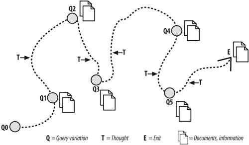
In the late 1980s, Dr. Marcia Bates came up with the berry picking model to describe how people search for information. This model describes the search for information as akin to searching for berries in a forest glade or a meadow. They collect the info (or in our metaphor, the berries) and move on. They may change their approach as they encounter new information.
Just as our berry picking strategy may change based on environmental cues, we make quick decisions about where to click based on “information scent” – the combination of visual cues that suggest we’ll find what we’re looking for.
Our brains are constantly seeking to simplify and organize complex information into meaningful patterns. When visual hierarchy aligns with these natural tendencies, it reduces cognitive load and makes interfaces feel more intuitive. Putting certain elements like search bars and product images in specific locations that users expect instills confidence in users because it provides a tangible marker – a clear guidepost that they’re in the right place.
Imagine trying to find a new friend’s address without the help of street signs? Or, even worse, what if the street signs weren’t where you expected them to be, like embedded in a tree or lying flat on the road (or vice versa, depending on where you live)? We expect certain elements to be in specific locations. When these expectations are met, we can navigate with more confidence. When they’re not met, we experience cognitive friction that can lead to frustration and abandonment.
Examples of Effective Visual Design in UI UX
Let’s look at two examples of how two very different types of websites implement visual design to guide and orient users.
Walmart’s Holiday Shop
Walmart’s Holiday Shop page uses several key design principles. Their search query field stands out against a blue background with a clearly contrasted search icon, making it instantly noticeable. They use white space to group elements based on content type – navigation at the top, topics at left, product categories in the center. Images are paired with text to make it incredibly easy to identify products by type (Trees, fashion, toys, etc.) The search bar remains consistently visible as users scroll, ensuring easy access from anywhere on the page.

St. Jude’s Homepage
Children’s cancer research center St. Jude takes a minimalist approach to its design, using red and blue to highlight the most critical information. The nonprofit operates entirely from donations, so it makes sense that the donate buttons are red and stand out the most.
The search bar is in the expected place, at the top of the page, and visitors can quickly drill down to the content they need thanks to intuitive navigation (e.g., Research, Training, Care & Treatment). If you’re a doctor, you know immediately where to click. If you’re a family who needs information, you have several places to start. But nothing is overwhelming and visual cues are easy to follow.

Common Design Mistakes in Visual Hierarchy
Even experienced designers can make mistakes when implementing visual hierarchy. Here are some common pitfalls to avoid:
- Overcrowding. When a webpage is too busy, users struggle to know where to begin looking. Lots of elements of equal size and color, a lack of proper spacing, and too many fonts can create a heavy cognitive load on site visitors trying to parse the information.
- Poor contrast. Color is compelling. It’s a powerful tool for emphasizing elements and communicating a design aesthetic. Color can also increase brand recognition by up to 80%, but hierarchy is more about the contrast between different elements than a specific color. Regardless of the colors you use, without adequate contrast, even well-organized content can become difficult to navigate.
- Choice Paralysis. According to Hick’s Law, when we’re faced with a lot of choices, we have a hard time deciding, a phenomenon known as choice paralysis. More choices = more paralysis. In digital UI, too many choices overwhelm users and make it difficult for them to navigate. It’s frustrating and creates confusion. This is why simpler layouts with less clutter create a better UX.
- Inconsistency. Failing to maintain consistency across different sections of a page or interface is disruptive to the flow of berry, er, information picking. When visual hierarchy isn’t uniform throughout a site, users must relearn navigation patterns with each new section they encounter. They may feel lost and seek berries in a much more organized forest.
Relevant viewing: UI Best Practices for Improved Relevancy
Trends in Visual Hierarchy and UX Design
Like most things digital, AI and data are changing the way we design digital experiences. Modern AI tools are enabling designers to create more dynamic, interactive experiences, where data visualization and content presentation adapt to user behavior. Adaptive interfaces allow for more personalized hierarchies. This is the future – visual hierarchy focused on making information personal and contextual.
As AI and machine learning continue to advance, we’re moving toward interfaces that can adjust their visual organization based on how we interact with content. The way information is structured and presented will become more intuitive and relevant for each user. From a visual design perspective, elements like navigation, search, and content blocks will adapt their prominence and positioning based on individual user patterns and preferences.
A user who frequently uses search might see that feature become more prominent, while someone who navigates primarily through menu categories might see those pathways emphasized in their interface. Hierarchy, after all, is personal – what I consider relevant may be different than what you consider relevant.
Relevant reading: Essential Search UX Strategies to Drive Business Outcomes
The Importance of Visual Hierarchy in Design
Strong visual hierarchy drives successful digital experiences. Users who can confidently navigate interfaces and quickly locate needed information develop trust in your brand. This promotes deeper engagement, which translates directly to business value: higher conversion rates, increased customer satisfaction, and meaningful brand loyalty.
Digital experiences grow more sophisticated each year, making thoughtful visual hierarchy essential for success. A UX designer or graphic designer that prioritizes user needs should strive to reduce cognitive load by using different design elements to maintain visual interest via larger objects and clear visual hierarchy.
Good usability relies on understanding that elements like color, contrast, and typographic hierarchy go beyond mere aesthetics. They fundamentally influence UX by guiding users’ attention, improving navigation, and enhancing overall usability.
Dig Deeper
Forrester reports that 43% of users on retail websites go straight to the search bar. But is it enough to have a search bar and call it a day?
The obvious answer is no. It is not enough to return results — you need to return the right results. And do so with a user experience that caters to what today’s site visitors expect.
This guide will walk you through 10 real-world examples of companies using AI-powered search to sculpt amazing digital experiences and improve real-life business outcomes.