Trying to figure out how to reduce cart abandonment? One of the biggest problems in the ecommerce world is cart abandonment rate, or the percentage of visitors abandoning their shopping carts on an ecommerce site. Cartabandonment can happen for several reasons and at different stages in the customer journey.
Some examples include when shoppers aren’t finding the most relevant product for their needs, or can’t pay for their purchase in a quick, easy (and yet safe) way—instead, they simply bounce.
It’s hard to overstate the business impact of this situation. The average shopping cart abandonment rate is at a staggering 70%. That’s quite an alarming figure, which directly translates into missed revenue opportunities for retailers. To truly appreciate the loss, Business Insider calculated the financial cost to retailers: 4.6 trillion USD.
Brands and retailers have focused on streamlining their checkout processes and avoiding shopper bottlenecks to try and address cart abandonment. Still, there is plenty of room for improvement when it comes to helping online customers find the most relevant products and nudging them to complete their purchases.
Luckily, we have curated the 10 top under-discussed tips for brands and retailers on how to improve their online shopping experiences and ensure that shoppers complete their checkout.
But why does shopping cart abandonment happen in the first place?
The Oft-Neglected Drivers of Cart Abandonment
The first, necessary step towards improving your cart abandonment rate is understanding where the friction lies in the funnel and the actual root causes for abandonment.
Among the top reasons for cart abandonment, shoppers often mention that the checkout process is overly complicated and that they don’t trust the website with their credit card information.
The good news is retailers who have made substantial and concrete efforts to improve their checkout page experience are rewarded. When they ensure that online shoppers can use a guest check-out, or don’t have to navigate through an unwieldy checkout flow or fill out unnecessary form fields, CAR soars.
The less good news, though, is that while ensuring a seamless, safe payment method is critical to a healthy cartabandonment rate, tackling cartabandonment requires much more than that.
It also requires helping your shoppers find the exact product they are looking for, prompting them to complete the transaction and removing any unnecessary friction.
But don’t worry—we’ll delve into 10 proven yet under-discussed tactics to reduce cart abandonment.
1. Leverage Social Proofing to Drive Confidence
If a shopper is hesitating about a purchase (for example, if it’s a big purchase or from an unknown brand) creating trust is a significant way to remove that uncertainty.
One of the best ways to do this is through social proof.
In particular, by providing a detailed account of a product’s quality and usage (5 bought in the last hour!) or authentic reviews can also minimize negative post-purchase product evaluation.
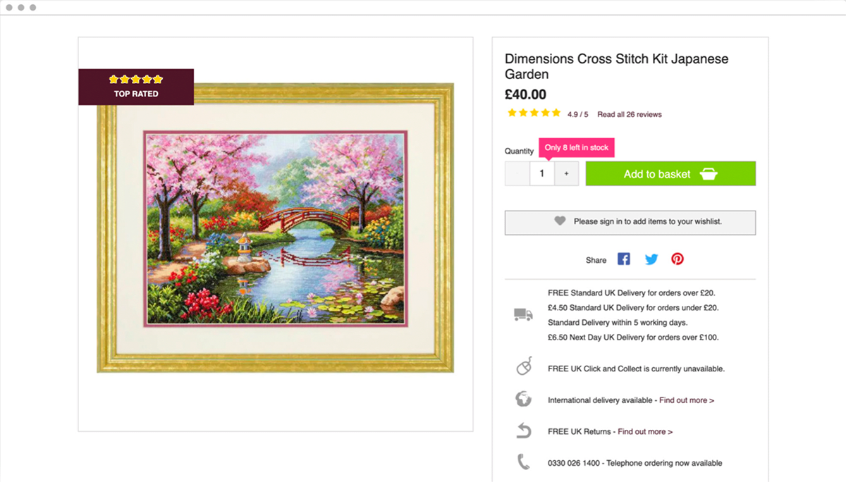
With that in mind, consider using a badge to highlight reviews on the product page. This can convey that the viewed item is “top-rated” and instill confidence and trust in the product and the brand.
2. Create FOMO to Retain and Nudge Your Shoppers
You can also offer irresistible, exclusive, and personalized deals that use scarcity and urgency to create Fear Of Missing Out, or FOMO.
Offering exclusive time-bound deals creates FOMO as shoppers are inadvertently tempted to make the purchase before they lose out on the offer. Similarly, for window shoppers, creating a sense of scarcity has quite an impact. Highlighting that a product they like is limited in quantity and likely to be unavailable soon might rekindle their purchase intent and entice them to buy it quickly.
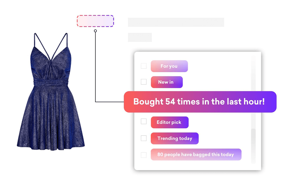
As shown in the image above, Coveo’s social proofing capabilities can be effectively used to surface information about the number of items left in stock or how fast a product or service is selling. This reinforces scarcity and influences purchasing decisions.
3. Include and Promote a Virtual Try on Feature
Virtual Try On can be an important feature for online visitors of fashion or apparel retailers. When shopping for clothes online, the main hesitation may be the inability to try the garments on. Oftentimes, potential shoppers may add a product to their shopping cart and then abandon the cart because of this high uncertainty.
Virtual Try On modules aim to reduce this hesitation by bringing the online customer experience closer to in-store shopping. The visualization is done either on a picture the customer uploads themselves, on a virtual “twin,” or on a model’s picture.
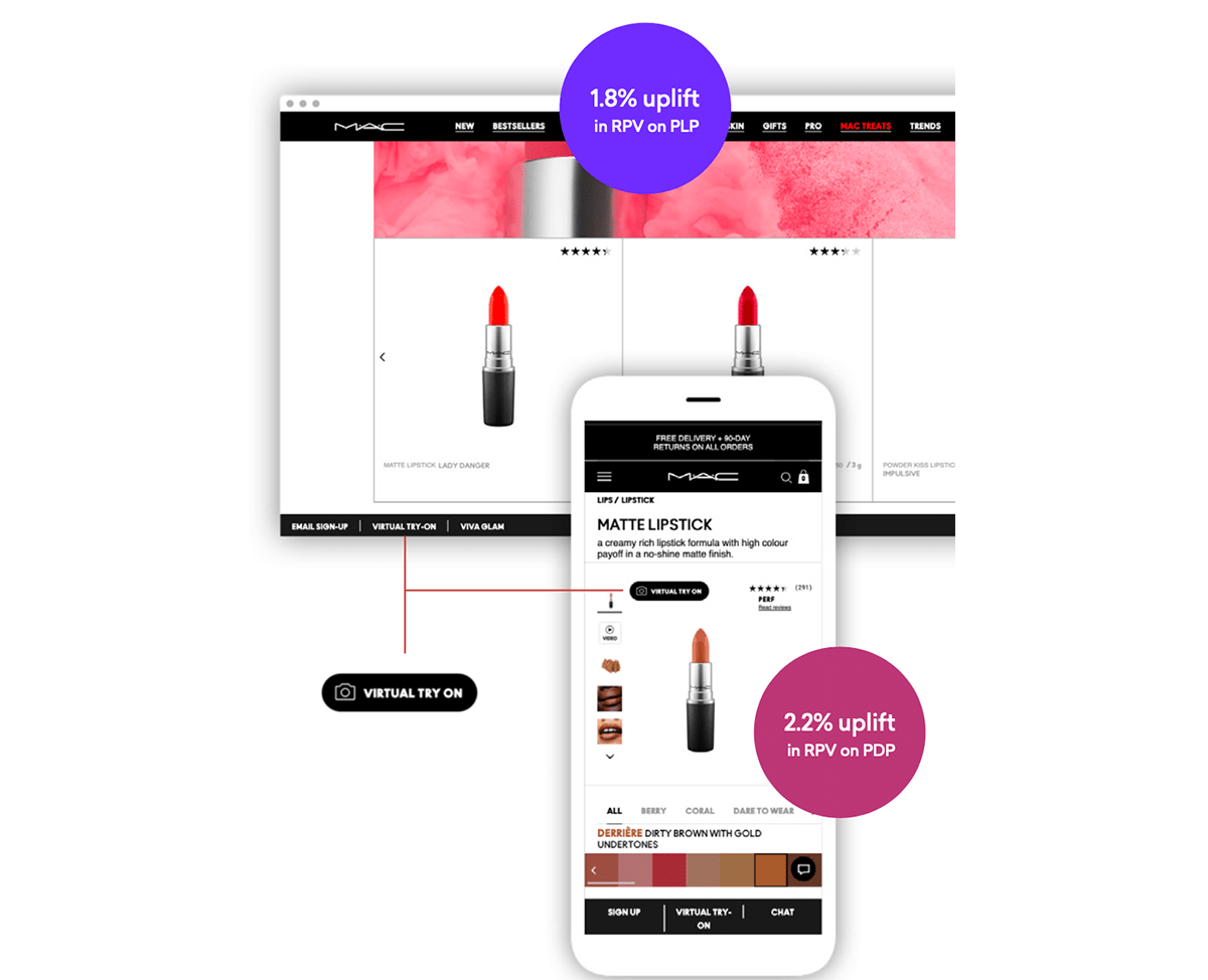
However this feature is only as valuable as the number of people who use it. Our customer, MAC cosmetics, solved this issue by prominently displaying this feature on the product detail page with a ‘virtual try on’ badge. The result was impressive, as it maximized the number of customers who could confidently make a product choice — and were thus less likely to abandon their carts because of product uncertainty.
4. Retain Shoppers with an Exit Intent Pop-up
Sometimes cart abandonment is driven by the shopper’s belief that they will find a better deal elsewhere. So, what can you do to ensure they will not abandon their shopping cart and your website?
Interestingly, pop-ups monitor visitors’ mouse movements on your online store and show themselves whenever they detect visitors abandoning the store. Exit intent pop-ups have evolved to now being custom-made to tackle cart abandonment.
They can be used to offer irresistible deals / free shipping, create urgency, offer support, or promote new items—all in an effort to retain the user on your website/app and keep them from abandoning their shopping carts.
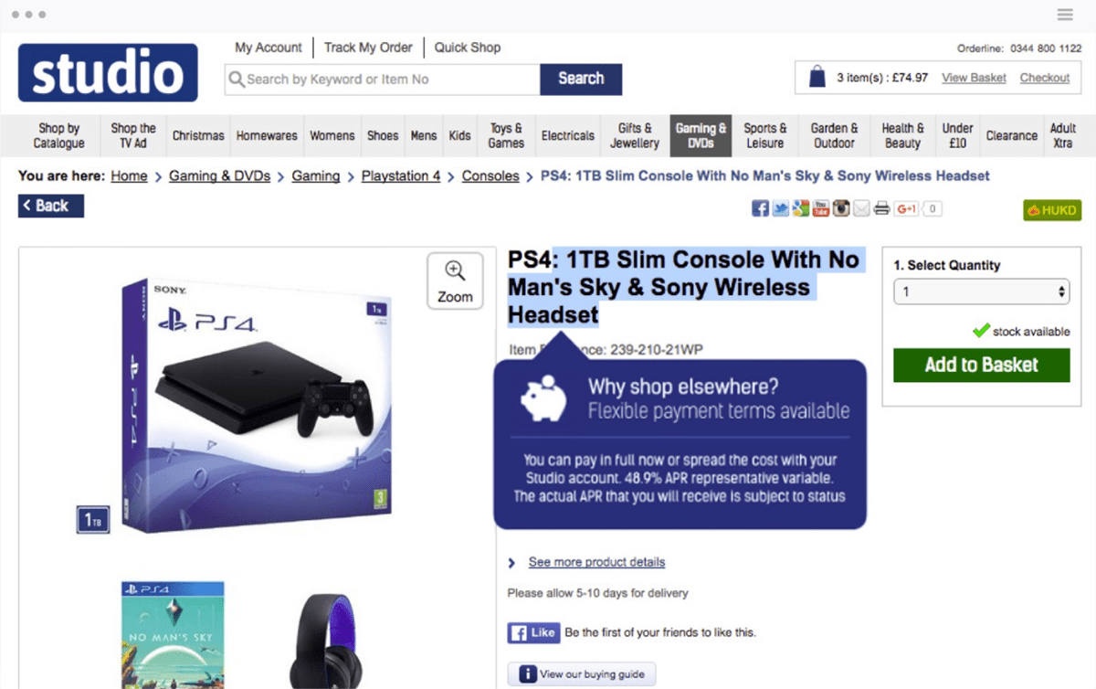
For instance, you can see how Express Gifts took advantage of Coveo’s technology to create a pop-up that outlines a flexible payment terms offer.
Yet, remember to always use discounts very wisely.
As tempting as it can be to entice commitment-phobes or cart abandoners with a discount, keep in mind that you are trying to recover sales, not to hurt your bottom line. Incentivizing costs real money and can quickly lead to low profit margins, especially if your regular customers start realizing they can simply abandon a shopping cart to get a discount.
So, offer discounts only when there’s a business justification for this.
5. Use Emails to Reclaim Abandoning Customers
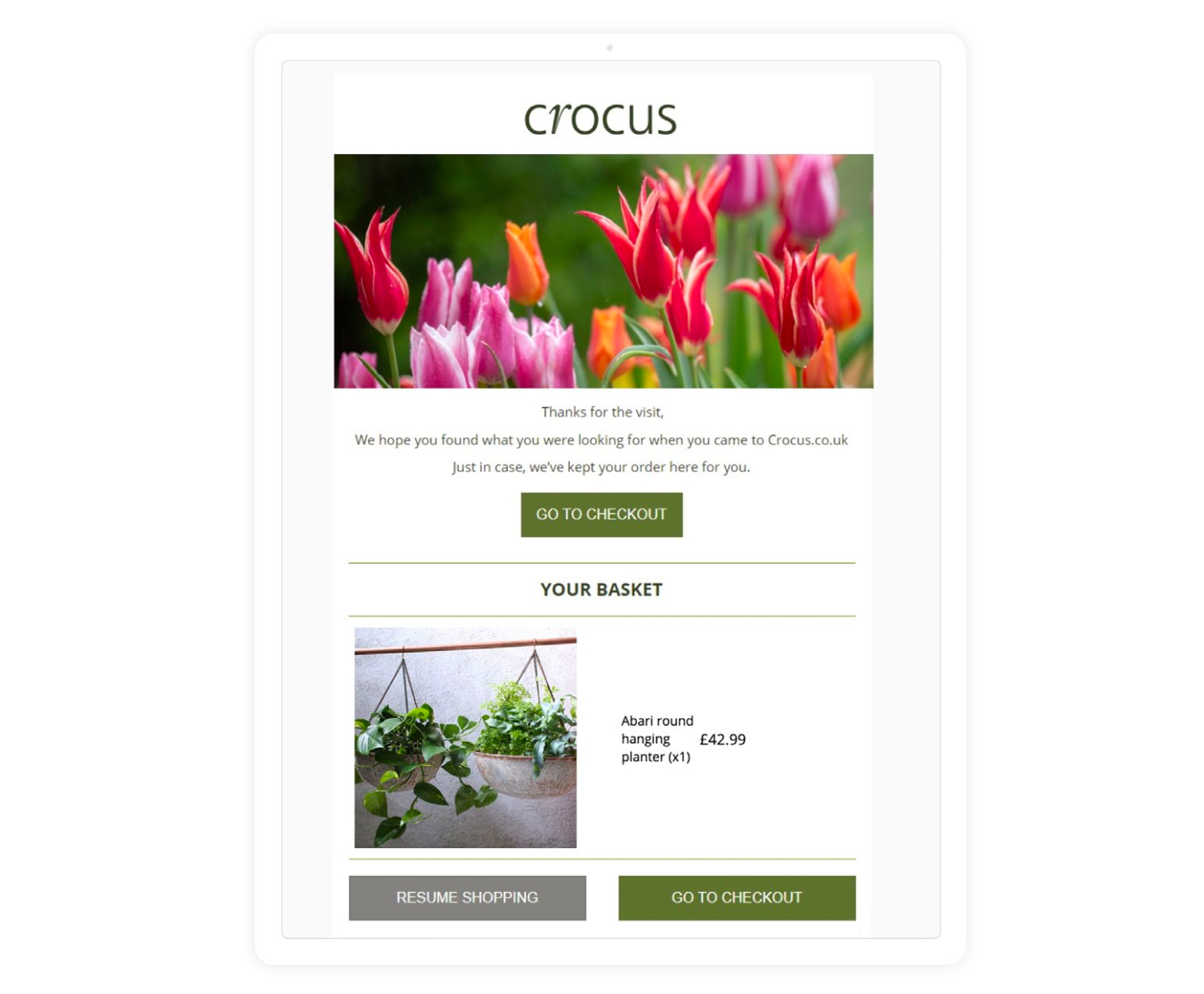
Sometimes it’s not possible to prevent your shoppers from abandoning their carts. But you can still reclaim abandoning customers afterwards. An effective way to reclaim customers after checkout abandonment is by using cart recovery emails.
This reminds shoppers that they haven’t completed their purchase and gives them an easy way to pick up where they left off. To streamline the customer journey, consider populating a link that takes them to the exact stage they were at before they left.
Below is an example from Coveo’s customer Crocus, who sends their shoppers emails to re-engage and nudge them to complete their purchase.
While this can be very effective, keep in mind that this solution will not work as a silver bullet. For someone to receive a cart abandonment email in the first place, they must have at some point opted-in to receive communications.
6. Add “Recently viewed” recommendations
Another useful tip to help reduce cart abandonment is to showcase “Recently viewed” or “View it again” recommendations. Technically, these are not actual recommendations, as they just display items the user has recently interacted with.
Yet they can be an effective and powerful tool to influence purchase: they allow customers to quickly re-visit an earlier choice, review product details, and add to their cart to complete the sale.
7. Test and Optimize Your Recommendations Placement
Retailers know that choice paralysis can be a key driver of high CAR. What they often do not know, however, is that recommendations poorly placed on a site may actually result in shoppers getting bogged down in their decision-making process and more likely to abandon their carts.
Where to place recommendations should be data-driven.
For example, data may show that similar rather than complementary items on the cart page actually hinders the purchase underway and leads to higher CAR. Meaning that giving more options of similar products at the wrong time can end up harming your sales.
So remember that it is important to test any hypotheses about the ideal placement of product recommendations and optimize accordingly.
8. Add Store and Fulfilment Facets to Avoid Disappointment
Buy online, pick up in-store (BOPIS) and curbside pickup have become increasingly popular. But the rise of BOPIS and curbside pickup also means that retailers and brands need to transparently and accurately show store availability to shoppers: you don’t want shoppers to spend time and effort choosing a product that is just right for them, adding it to their cart—just to find out that it is actually not available at their nearest store or pick-up location.
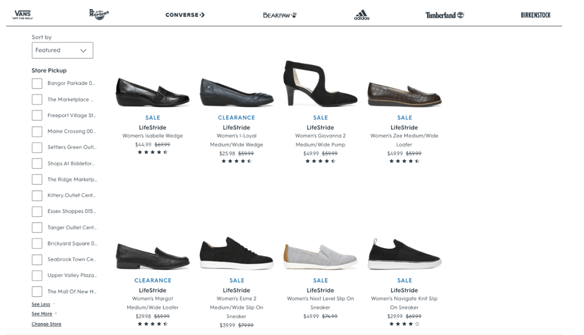
A good example of a well-executed BOPIS functionality is the one deployed on the Famous Footwear site, a Coveo customer. Famous Footwear uses store fulfillment facets directly on the product listing page to allow customers to filter products based on the stock availability in a given location.
Additionally, shoppers can filter on size, color or brand directly on the product listing page. This removes friction from the entire experience since shoppers no longer need to continuously navigate back and forth between the product listing and product detail page to determine the availability of the exact shoe that matches their needs.
9. Use Product Badges to Simplify Comparison
A shopping cart is not just a shopping cart: it’s also a form of external memory, a tool that allows users to remember and easily access items of interest.
Online shoppers often use the cart as a holding area to compare items, save products while they continue to shop, or to come back to in later sessions. But if product comparison isn’t easy for them, they will simply bounce—leaving you with yet another abandoned cart.
The good news is that displaying product badges (also referred to as labels, stickers, tags, or markers) can be a powerful way of reducing your CAR. Badges can simplify your shoppers’ navigation by quickly and easily highlighting special attributes of different products (Is it ‘New’? Is it ‘Eco-friendly’? Is it a ‘Bestseller’?), thus helping customers differentiate between products.
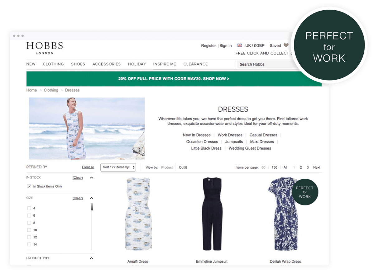
In the example above, you can see how Coveo’s customer Hobbs is badging products based on particular variables like ‘Perfect for Work.’ This gives each visitor a relevant piece of context and makes it easier for shoppers to select the most relevant item.
10. Display Free Shipping Promotions
Above, we listed two of the top reasons for cart abandonment (an overly complicated checkout process and a lack of trust in giving credit card details to websites). Here’s a third: Nearly 55% of shoppers noted shipping and returns.
While online shopping is convenient for product discovery, it can also come with an added layer of stress or anxiety. If the added shipping costs (especially for expedited shipping options) is steep, the decision to purchase can become less attractive as shoppers leave to find more favorable options with other retailers.
Retailers can combat this by having shipping policies and promotions prominent throughout the site. For example, highlighting free shipping on orders over a certain threshold or a timely promotion on expedited shipping rates in a site-wide banner.
Of course, with any of these reduce cart abandonment tips, you should think about experimenting with A/B testing. What worked? What didn’t?
And then let us know!
Dig Deeper
Looking for deeper insights on how to optimize your conversion rate?
In our Ultimate Guide to Conversion Rate Optimization in Ecommerce, you’ll learn how to leverage synergies between touchpoints, harness the full power of analytics, and a three-step testing process for encouraging outcomes.

